Live Ocean is a non-profit focused on protecting the ocean through sailing and educational programs. I did some pro-bono work for them including a logo and UX explorations.
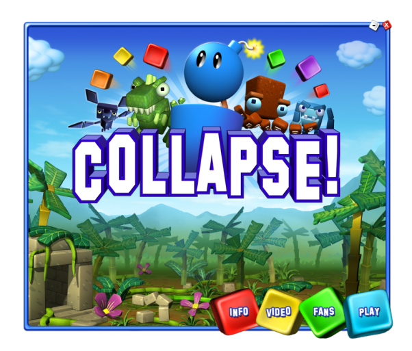
This project (via Filter) was designing visual elements of a facebook campaign for the social game Collapse! by Real Networks.
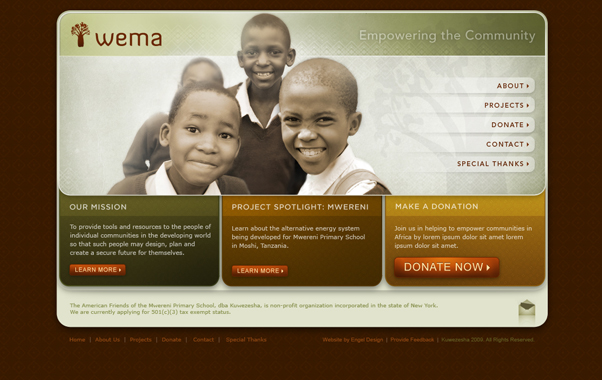
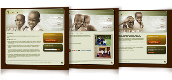
Wema (meaning to empower a community) is a small non-profit focused in Moshi, Tanzania working primarily with Mwereni primary school, which has a significant focus on educating children who are blind. This website design was a pro-bono project.
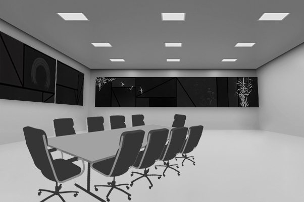
This project (via Filter) was to design the default state of eight screens covering the walls of Craig Mundie’s (Chief Research and Strategy Officer at Microsoft) conference room. The themes were a fusion of geometric post-modernism and organic Asian elements. Because these designs are projected quite large and viewed from various distances, the intention was to create simple elegant forms from far away with fine detail and texture up close.
This design won Judges Pick in the UNESCO International Cultural Diversity Festival logo competition. I was one of four winners chosen from over 1000 entries from 80 countries.
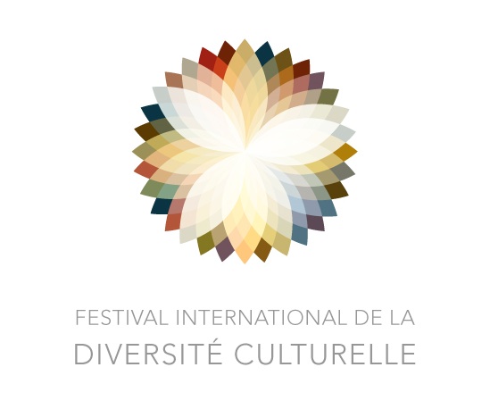
Shades of Unity by Deja Engel:
When I envision cultural diversity in the world, I don’t think of a perfect spectrum of different entities, but rather a mix and mash of cultural influences blending together in places and starkly contrasting in others. These relationships are not always easily understood up close, but if you step back and see the whole, each element has its place in creating unity.
This symbol represents these sometimes erratic and sometimes similar shades of culture through the variety of changing and blending colors. The circular shape alludes to the world and the unity of humanity.
Used as a logo, this could be incredibly flexible. The logo could also be used with or without typography in a variety of ways. The color palette could be shifted for different purposes and could be animated as the colors slowly transform to represent the transitive and fluid nature of culture.
Selected by Jacques Lange, President of Icograda:
My personal judge’s pick is Shades of Unity which I chose to be the benchmark by which I evaluated all other entries from the first moment that I saw it. It is a timeless, culturally sensitive, beautifully crafted and an intelligent solution. It is not a new idea, but it is executed in a very intelligent manner because of its flexible ability to work as a corporate identity system over many media applications instead of just being a static identity/brandmark. It is symbolically powerful and contains multiple levels of narratives, which represents and transcends many complex aspects of culture and diversity internationally. It also has an ethereal quality, which few other entries achieved to encapsulate – cultural diversity is a spiritual and emotive concept and this entry personifies it. The most impressive aspect for me is that it is one of the few solutions entered into this competition that functions as well in a monochromatic version as it does in the full-colour configuration without altering the core message. In addition, I believe that this entry was one of the few that paid attention to the delicate balance of selecting, crafting and balancing the typography and graphic elements. For me, it is an undisputed winner and no other entry answers the brief as intelligently and comprehensively as this entry.